[数据可视化] 水浒传人物出场次数
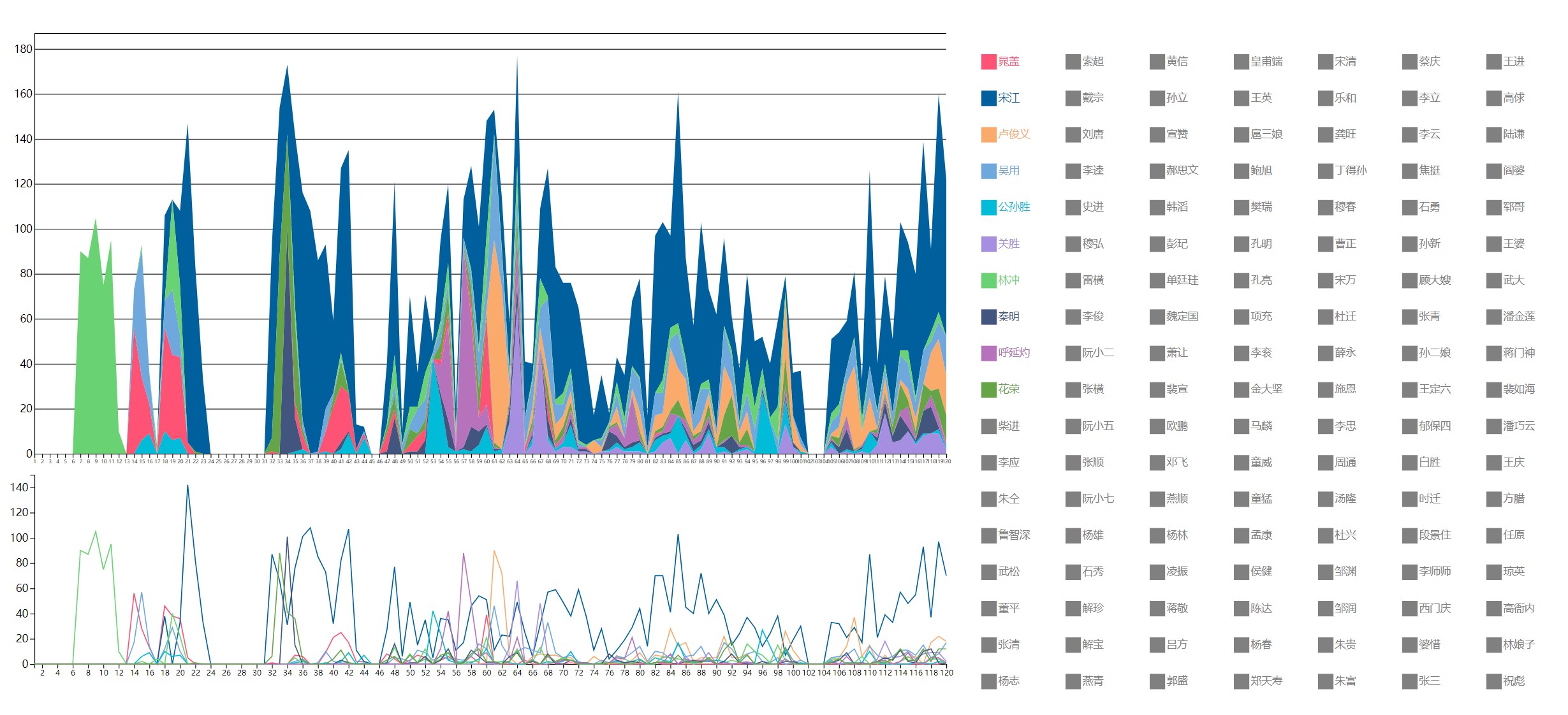
水浒传人物出场次数
开源地址
运行环境
d3.js html
代码分析
坐标轴
坐标轴由三个部分组成,比例尺、坐标轴和绘制坐标轴
比例尺
比例尺的作用是将不同的数据大小转换为坐标轴范围的位置,其一种实现语法如下:
// 图一坐标轴
var xScale1 = d3.scaleLinear()
    .domain([1, 120]).range([0, 1300]);
var yScale1 = d3.scaleLinear()
    .domain([0, 650]).range([600, 0]);
scaleLiner()指的是一个线性比例尺,指的是数据范围与坐标轴范围成线性对应关系
domain()中是实际的数据大小范围
range()是坐标轴的位置范围,网页坐标系中x,y是一个以左上角为原点,向右为x正方向,向下为y正方向的坐标系,所以在设置y轴比例尺时,值越大对应的y值越小。
坐标轴
坐标轴是为了描述坐标轴的样式
const xAxis1 = d3.axisBottom(xScale1)
    .ticks(120);
const yAxis1 = d3.axisLeft(yScale1)
    .ticks(7).tickSize(-1300);;
这里仅设置ticks(),用于设置坐标轴上有多少个刻度
绘制坐标轴
var gx1 = svg.append("g")
.attr("transform", "translate(" + 50 + ", " + (yScale1(0) + 50) + ")")
    .attr("class", "axis")
    .call(xAxis1)
    .attr('font-size', 7)
使用画笔绘制坐标轴,使用transform调整相对位置,如果坐标轴是不变化的,其实也可以将这三个变量写在一起,但是在这个可视化图中,左上角图的y轴可能从100多变化到600多
分开之后方便与设置一个坐标轴变化的动画:
yScale1.domain([0, max + 10]).range([600, 0]);

        gy1.transition()
            .duration(200)
            .ease(d3.easeLinear)
            .call(yAxis1)
其中max是当前数据中的最大值。
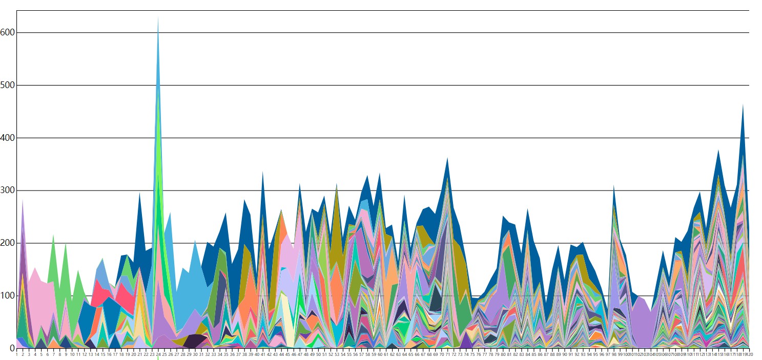
颜色
由于水浒传中出现的角色有150+位,需要大量不同的颜色来分别不同的角色;d3.js分配颜色的原理与比例尺原理相同,将每个名称对应的给每个颜色,所以我们需要将我们想要分配的颜色合并到同一个集合当中去:
var colors = []
    colors = d3.quantize(d3.interpolateHcl("#f36363", "#2A4858"), 10)
    colors.push(...d3.quantize(d3.interpolateHcl("#04e153", "#362142"), 10))
    colors.push(...d3.quantize(d3.interpolateHcl("#19a48d", "#aa9812"), 10))
    colors.push(...d3.quantize(d3.interpolateHcl("#f8a9a9", "#98deea"), 10))
    colors.push(...d3.quantize(d3.interpolateHcl("#9e98ea", "#b76eb4"), 10))
    colors.push(...d3.quantize(d3.interpolateHcl("#FFFFE0", "#FF7256"), 10))
    colors.push(...d3.quantize(d3.interpolateHcl("#6fa8dc", "#f1c232"), 10))


    colors.push(...d3.quantize(d3.interpolateRainbow, 10))

    if (!Array.prototype.derangedArray) {
        Array.prototype.derangedArray = function() {
            for (var j, x, i = this.length; i; j = parseInt(Math.random() * i), x = this[--i], this[i] = this[j], this[j] = x);
            return this;
        };
    }

    colors = colors.derangedArray();
    var color = d3.scaleOrdinal()
        .domain(keys)
        .range(colors);
最后一个color变量就是函数,将人物名称与颜色对应,当调用color并传入名字时,会返回对应的颜色
重新绘制函数
在右边的矩形框中,是可以选取要展示的角色的,每次重新选取都会重新绘制上图中的堆叠图,并将下图折线图中的对应曲线设置为显示
堆叠图数据的获取
const stackedData = d3.stack().order(d3.stackOrderAscending)
            .keys(currentkeys)
            (data)
使用d3.stack函数就可以获取堆叠图了,keys()中可以设置需要绘制的角色,没有在currentkeys中的角色不会被加入到堆叠图当中去
svg.append("g")
            .selectAll("mylayers")
            .data(stackedData)
            .join("path")
            .style("fill", function(d) { return color(d.key); })
            .attr("d", d3.area()
                .x(function(d, i) { return xScale1(d.data.chapter); })
                .y0(function(d) { return yScale1(d[0]); })
                .y1(function(d) { return yScale1(d[1]); })
            )
            .attr("transform", "translate(" + 50 + ", " + (0 + 50) + ")")
            .attr("class", function(d) {
                return "myPath " + "myPath" + d.key
            })
            .attr("visibility", function(d, i) {
                return "visible";
            })
接下来就可以调用函数绘制图像了!
后记
这是暂时做过的最复杂的可视化训练题,需要处理三个大板块的内容,并设置不少的交互,可以看出训练营题目的质量之高,更多的细节可以参考源码。
标题:[数据可视化] 水浒传人物出场次数
作者:chen
地址:http://blog.chen.szkxy.net/blog/articles/2023/09/26/1695730896116.html
 评论
评论
0 评论
